MINNEAPOLIS, MN — Purchasing a home in an online foreclosure auction isn’t for the faint of heart. Neither is consciously moving forward knowing that the historic 1921 home needs major renovations. Yet, Heather Peterson’s clients placed their bid anyway, won the auction and are now partway through a multi-year plan to restore and update their forever home in Minneapolis, MN.
“It’s a beautiful old home that, except for a kitchen renovation in the ’80s, hadn’t really been touched,” says the principal designer of Heather Peterson Design in Minneapolis, who collaborated with Rehkamp Larson Architects and JS Johnson and Associates.
The homeowners dipped their toes into the project by decorating the sunroom, entry and stairwell. Phase two included renovating the kitchen and primary bath, along with building an addition on the back of the house to accommodate a mudroom and powder room (see sidebar below). Subsequent phases will take place over the next few years to remodel the remaining interior spaces, update the exterior and build a new garage.
“Sometimes people think they should do everything all at once,” notes Peterson. “But there are a lot of benefits to making renovations in stages. Cash flow is certainly one, but decision fatigue can set in, so taking your time can prevent people from getting to a place where they don’t care, they just want it done.”


Guiding Principles
Decisions for this home’s renovation, including that of the kitchen, focused on the idea that it feel as original as possible while updating its function for the 21st century.
“We were very thoughtful about finish selections, and we looked for ways to bring features into the kitchen to make it feel connected and tied to the rest of the home,” she says.
For example, it was determined that the original woodwork throughout the home is mahogany.
“Originally, we wanted to use it in the kitchen,” she acknowledges. “But sourcing and price were issues, so we turned to walnut, which has a similar grain pattern. Then we stained it to match the existing woodwork.”
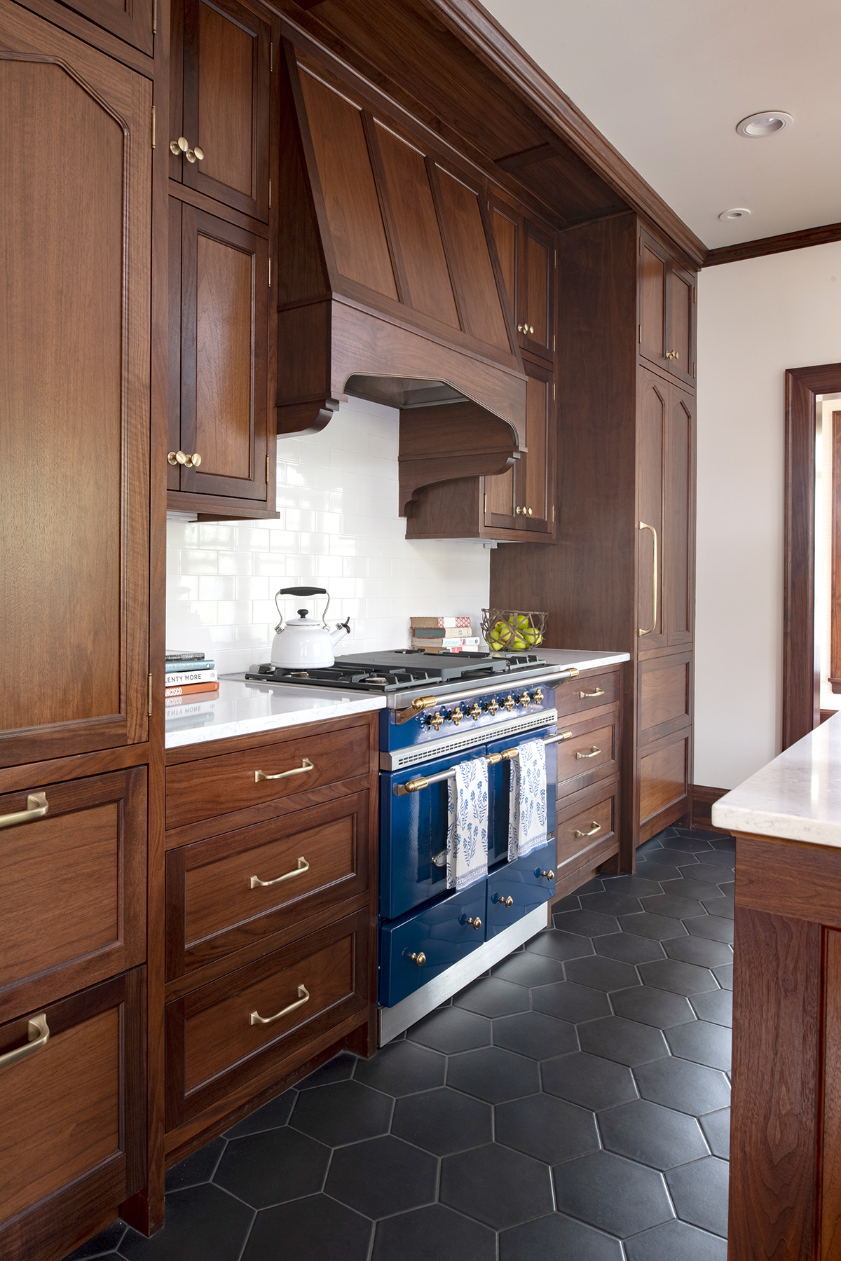
There are also details in the custom cabinetry that the architect adapted from millwork in the home, such as the arch on the ventilation hood, paneled refrigerator and doors of the pantry and select upper cabinets. Their Tudor shape was adapted to resemble the arch in the walkway between the sunroom and living room. Similarly, brackets at the island and upper cabinets on the window wall take their silhouette from an element on the side of the stairs.
Another guiding influence of the historic house was its lighting.
“The house was full of original lighting, which played into several decisions,” she says.
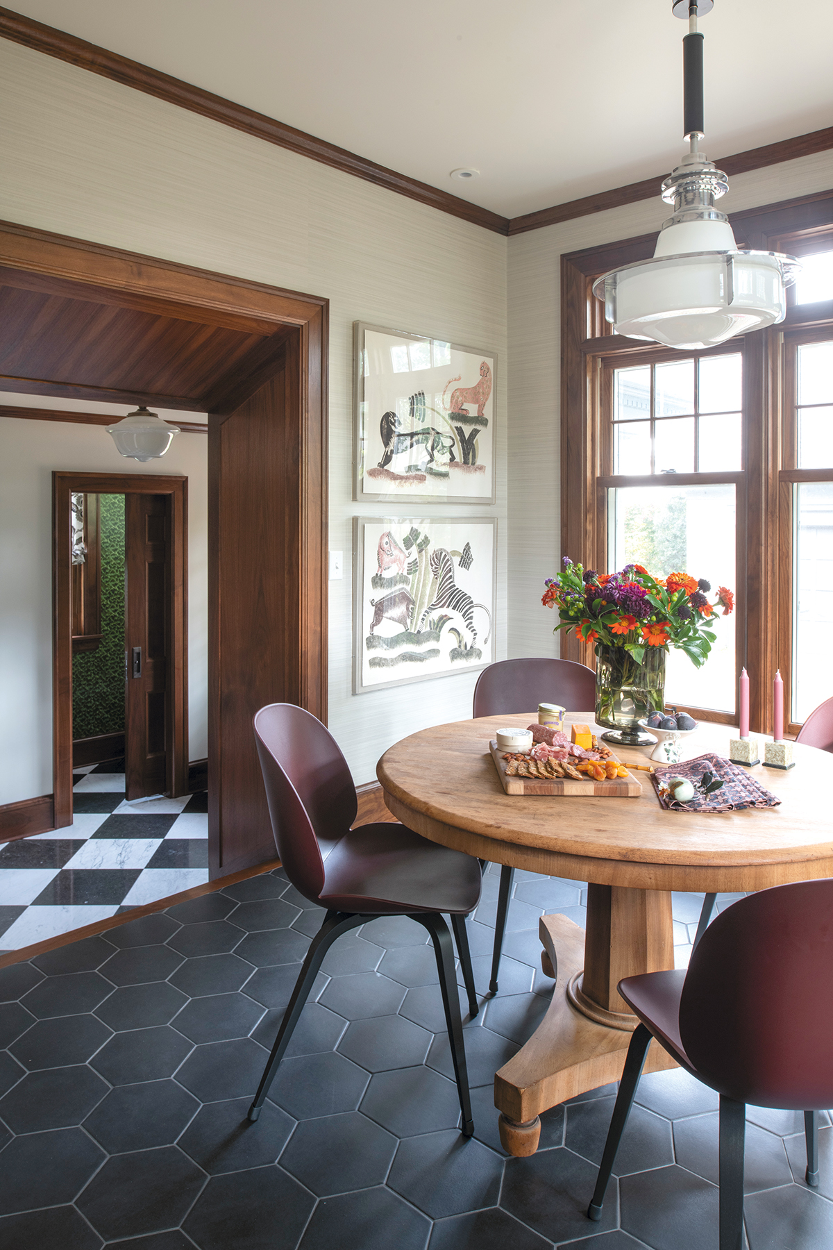
For example, the pendant above the table in the breakfast room, which adjoins the kitchen, is from the 1930s.
“It’s completely vintage,” Peterson relates. “It’s an amazing fixture that didn’t need any modifications…it was meant for the room.”
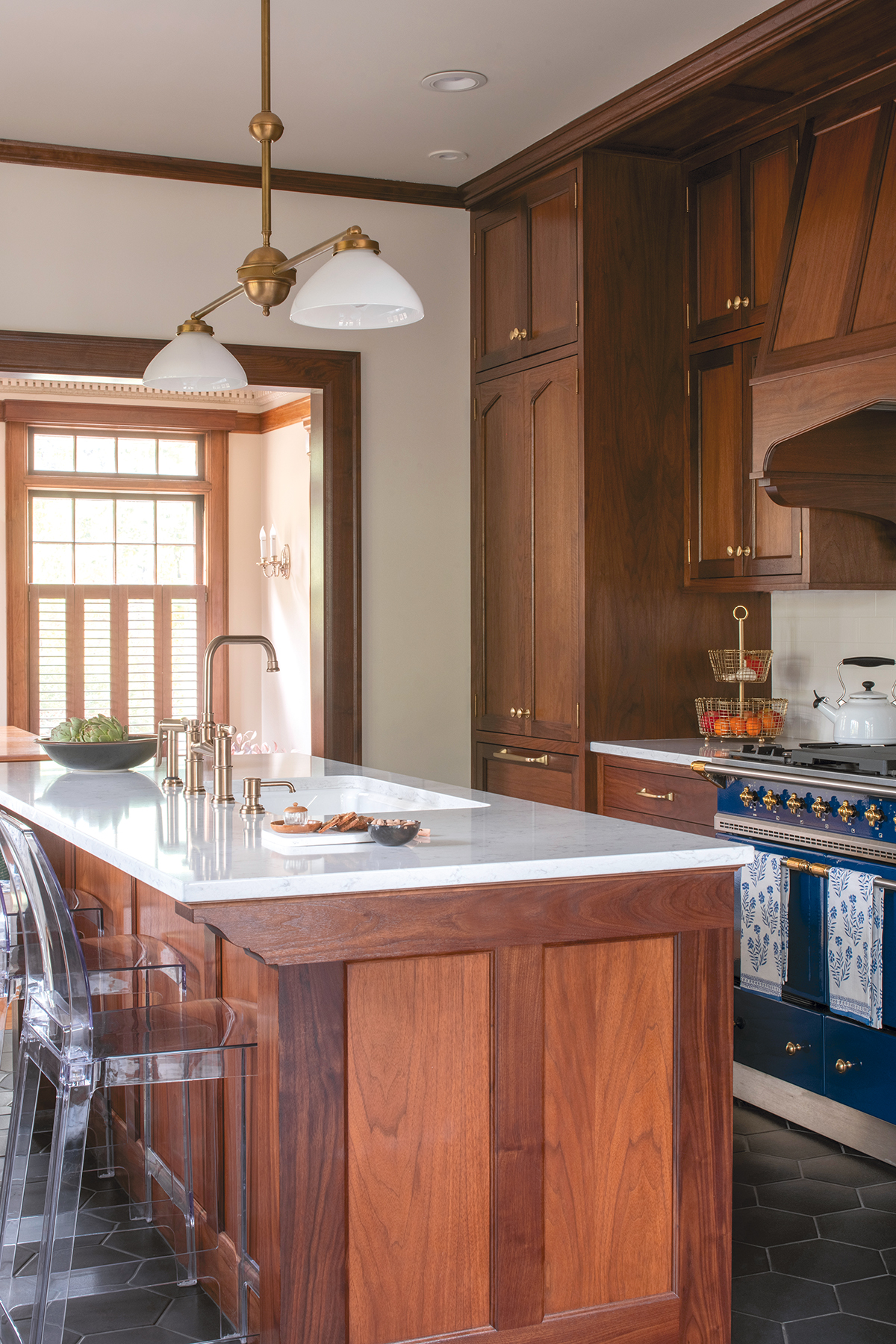
As well, the pendants above the island and the sconces above the kitchen windows feature vintage glass shades with fixtures customized by Lightworks.
“They are a hybrid of old and new, customized for the space,” she says.

Made for Modern Living
While remaining true to the home’s heritage was important, so was ensuring modern-day functionality. As such, Peterson notes that a long island with bar seating wouldn’t have been original to a 1920s home. But its inclusion speaks to the mandate for modern living for the family with two young boys.
The island also serves to separate the two symmetrical sides of the walk-through kitchen. To one side, the focal-point Lacanche range provides a pop of color and joins the surrounding Sub-Zero refrigerator and matching pantry/freezer drawers. The facing wall is comprised of inswing windows – chosen for their historical worth – that are flanked by perfectly proportioned cabinetry, which also includes a panel for the Marvel undercounter refrigerator.
The countertop choice – Viatera’s Minuet quartz from LX Hausys – was a direct result of the need for functionality and practicality as well.
“This homeowner really likes things to be pristine,” Peterson relates. “Normally, in a house of this era I would suggest marble because it’s a material that may have been original to the home. But my client wasn’t interested in living finishes or anything that would patina, so we used quartz that has a really soft veining pattern. It looks like marble, but is more durable.”
Given the cabinetry’s relatively dark stain, choosing a light color helps brighten the space. So do the glossy white 3″x6″ Heritage Tile subway tiles used for the backsplash.
“We wanted to stay in an historic place,” she explains. “This tile is a reproduction, but it’s about as authentic as we could get. We also kept the grout lines very tight so it almost reads as a solid white surface.”
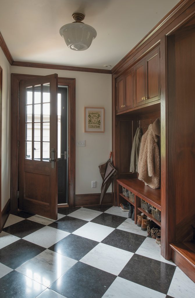
The floor, comprised of 9″ hexagon tiles from Encore, also speaks to a desire for practicality. While the homeowner initially considered slate – which would have related to the home’s history given its original slate floor entry and roof – these ceramic tiles offered greater durability. Plus, their finish adds warmth and bounces light without being too shiny, and their Blacksmith colorway offers a connection to the Belgian bluestone used as part of the checkerboard pattern in the floor of the adjoining mudroom.

“The floor was one of our biggest challenges, in part because there is so much of it,” Peterson relates. “We also had a very tight palette, so every decision had to be just right. Some people may be hesitant about a dark floor, but she likes cozy spaces.”
Like the quartz and tile, brass cabinetry hardware (Water Street Brass pulls/knobs and Horton Brasses exposed hinges) was chosen for its historical value and present-day functionality.
“Normally I would use unlacquered brass for a home of this age,” she relates. “But my client didn’t want anything that would show fingerprints or change over time, so we chose these brass knobs and pulls that – from the get-go – have a great sense of depth like unlacquered brass yet they won’t patina.”
Similarly, the Brilliance Luxe Gold Brizo faucet wouldn’t have been original to the home, but its bridge configuration confirms a traditional feel without being overly fussy.
“There is a difference between restoration and preservation,” she relates. “We weren’t necessarily trying to be 100% accurate to the time period. Rather we wanted it to have an essence of the time while still working for a contemporary family, who actually has quite contemporary taste. That’s where some decisions, such as the vintage Lucite bar stools, come into play. We could have gone in a very different direction. But with two little boys, she wanted something that would be easy to clean while being light hearted and contemporary.” ▪
Historical influences


The mudroom and powder room are part of an addition to the back of the house, completed simultaneously with the kitchen renovation. Both spaces echo similarities to the kitchen. Most notable in the mudroom is the floor-to-ceiling wall of custom walnut cabinetry and cubbies and a vintage glass light shade.
The powder room also showcases a vintage light shade reminiscent of the era of the house. Its green exterior matches the moody Shumacher Tortoise wallpaper, while its gold interior complements the antique mirror, Brizo Brilliance Luxe Gold faucet and Palmer Industries metal legs of the custom vanity. The latter is topped with Viatera Minuet quartz from LX Hausys and features a backsplash shaped to mimic millwork found in the rest of the home. ▪

